中文简体
 русский
 Français
 Español
 Deutsch
 عربى

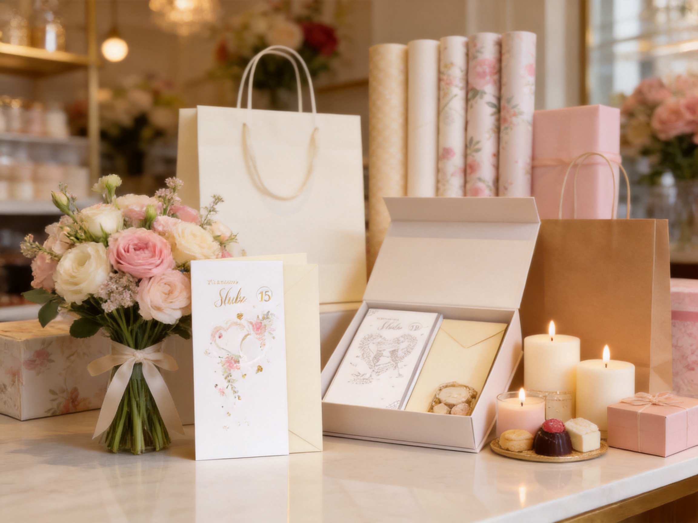
Valentine’s Day stationery often succeeds through small details rather than excessive decoration. A carefully chosen floral motif, a refined paper surface, an appropriately proportioned envelope, and a few tactile finishing techniques can create a stronger emotional impression than a design overloaded with color or ornament. The Valentine’s Light Style Floral Paper Greeting Card is developed around this principle. It combines a soft floral theme, a tall and slim format, raised paper details, and selective foil treatment to create a card that feels light, personal, and visually distinctive.
Designed for seasonal gifting, flower shop arrangements, gift boxes, event stationery, and personal exchanges, this greeting card offers a flexible presentation solution for buyers who want something more considered than a standard flat-printed card. Its design is gentle enough for romantic messages, friendship gestures, spring-themed collections, and floral gift programs, while its dimensional surface gives it a memorable physical quality.
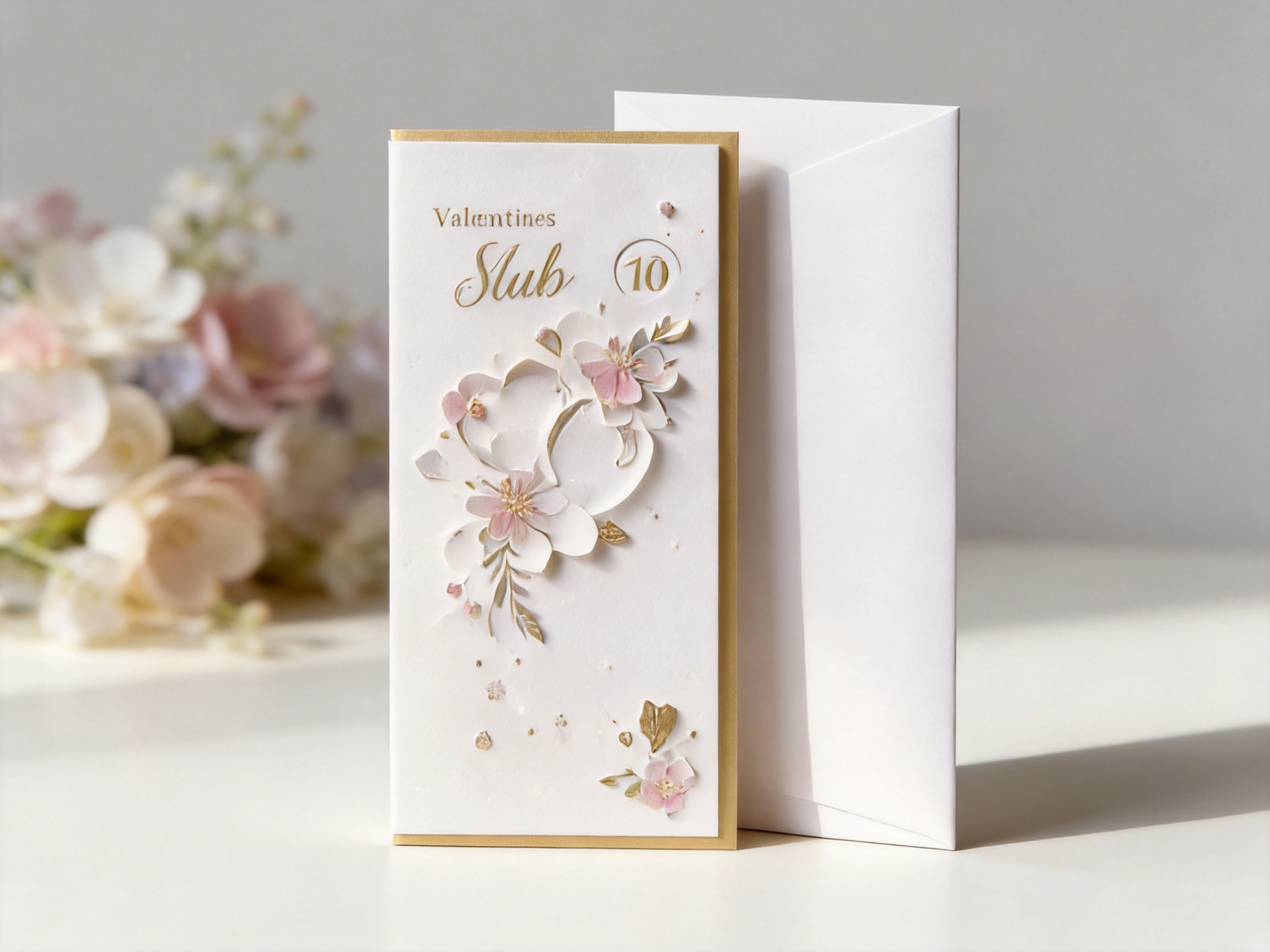
The card measures 11.5 x 22 centimeters and is supplied with a 12 x 22.5 centimeter envelope. This proportion gives the complete set a narrow, elegant appearance. When displayed on a retail shelf, placed inside a flower arrangement, or included in a packaging bundle, the elongated shape helps it stand apart from more conventional rectangular greeting cards.
Its main treatments include 3D Paper Tips and Spinning Numbers Bead Emboss foil. These processes create a combination of raised paper texture and reflective detail. The finish is not designed to overpower the floral artwork. Instead, it introduces subtle depth that becomes more visible when the card is moved under changing light or touched by the recipient.
Product Overview and Design Direction
The Valentine’s Light Style Floral Paper Greeting Card is built around a soft floral visual language. Rather than relying on heavy romantic symbols, saturated colors, or dense decorative patterns, it uses the natural appeal of flowers to communicate affection. This makes the card suitable for customers who prefer a calm, modern, and lightly playful Valentine’s product.
The floral theme also provides commercial flexibility. A strongly themed card may only appeal during a short Valentine’s selling period, while a restrained botanical design can be incorporated into broader seasonal assortments. Retailers may position the card as a Valentine’s greeting, a flower-shop message card, a spring stationery item, or an addition to a premium gift set.
The visual concept is especially useful for businesses that sell products through multiple channels. In a physical store, the raised details can encourage customers to pick up the card and examine it. In a gift-box presentation, the slim format can fit beside flowers, confectionery, cosmetics, candles, or small accessories. In an online product range, the foil and dimensional treatment provide clear points of differentiation that can be communicated through close-up photography.
The design also supports a broad range of messages. It can be used for romantic declarations, short notes accompanying flowers, thank-you messages, seasonal greetings, and simple personal exchanges. Because the visual treatment remains relatively light, the card does not force the buyer into one highly specific emotional tone.
Format and Proportion
The card size is 11.5 x 22 centimeters, while the envelope measures 12 x 22.5 centimeters. This proportion produces a tall, slim silhouette that differs from the common square or horizontal greeting card format. The narrow structure creates an elegant visual rhythm and can make a simple message feel more intentional.
Proportion is important in gift presentation. A card that is too small may disappear beside a bouquet or a large gift box. A card that is too wide may take up unnecessary space or compete with the main gift. The elongated format of this product offers a balanced alternative. It is visible enough to be noticed but compact enough to be inserted into many gift arrangements.
The matching envelope is slightly larger than the card, allowing the card to be enclosed neatly while preserving the slim appearance. The envelope is not merely a protective accessory. It completes the presentation and gives the product a finished, retail-ready appearance. For wholesalers and gift businesses, this means the card can be added to an assortment without requiring a separate envelope-sourcing process.
The format may also benefit merchandising operations. Slim products can be arranged in upright displays, grouped by color or message, or placed in narrow compartments near checkout areas. Flower shops can slide the card into bouquet sleeves or attach it to a ribboned arrangement. Gift-box producers can position the envelope alongside the main product without making the package feel crowded.
Compared with standard greeting cards that depend mainly on front-cover artwork, this format makes proportion part of the product identity. Its height-to-width relationship creates a more contemporary impression and can help a seasonal collection appear visually varied.
Material and Surface Experience
A greeting card is both a visual product and a tactile product. The buyer often makes an initial decision based on color and composition, but the recipient experiences the card through touch, folding, opening, and handling. The Valentine’s Light Style Floral Paper Greeting Card is designed to make that physical interaction meaningful.
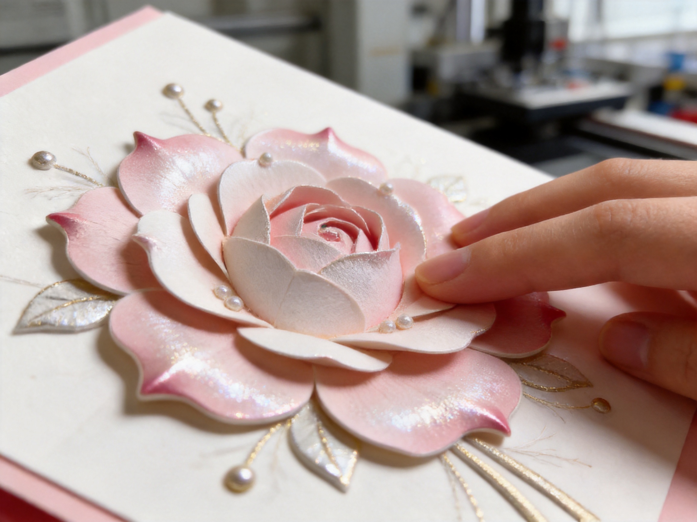
The surface includes 3D Paper Tips applied to selected areas of the floral design. These raised paper elements provide a modest level of dimension without making the entire card feel bulky. When the card is touched, the recipient can identify differences between the printed surface and the elevated details. This creates a stronger sensory experience than a completely flat image.
The dimensional treatment also influences how the card catches light. Raised sections can produce small changes in shadow and highlight as the card moves. This effect supports the natural character of the floral design, because petals and leaves are associated with layered forms, gentle contours, and organic variation.
The product does not depend on excessive embellishment. Its advantage comes from the coordination of several restrained features: the floral artwork, the slim format, the raised paper tips, and the reflective foil treatment. This approach can be more commercially versatile than a heavily decorated card, particularly for buyers seeking an elegant product that is easy to combine with other gifts.
The tactile finish may also support premium positioning. Consumers often associate texture with greater attention to detail, especially when the surface treatment is aligned with the artwork rather than added randomly. For retail buyers, that perception can help distinguish the product from low-cost cards that use only standard printing.

Valentine's Light Style Floral Paper Greeting Card
Foil and Embossed Detail
The card includes Spinning Numbers Bead Emboss foil treatment. This specialized decorative effect combines reflective foil characteristics with embossed or bead-like dimensional detail. The result is a surface that can appear different depending on viewing angle, light direction, and distance.
Foil is often used to create a sense of celebration, but uncontrolled foil coverage can make a card look overly bright or visually heavy. Here, the foil detail is described as a supporting element rather than the dominant feature. It contributes movement and depth while allowing the floral design to remain the main visual focus.
The reflective quality is valuable in retail environments. Under store lighting, a small amount of foil can attract attention without requiring a loud color scheme. As shoppers move past a display, changing reflections can help the card stand out from flat printed products. In a gift arrangement, the foil may add a subtle festive accent that complements ribbons, metallic packaging, or decorative accessories.
The embossed bead effect adds another level of distinction. Flat foil may be attractive from a distance, but embossed foil encourages close inspection. The recipient can see and feel the details, making the card more memorable after it has been opened.
From a design perspective, the foil treatment supports the light style of the product by introducing controlled highlights rather than a full metallic surface. This is an advantage over cards that use large areas of foil without sufficient balance. The floral theme remains calm, while the reflective detail provides just enough sparkle for Valentine’s gifting.
For buyers developing a coordinated range, this finish can also serve as a product-level upgrade. A collection may include basic printed cards, textured cards, and cards with dimensional foil. The Valentine’s Light Style Floral Paper Greeting Card can occupy the more tactile and decorative position within that assortment without becoming visually disconnected from simpler designs.
Advantages Compared with Conventional Flat-Printed Cards
The most direct competitive advantage of this greeting card is its combination of visual softness and physical dimension. A conventional flat-printed card may communicate a message effectively, but it often offers little interaction beyond reading and viewing. The raised paper tips and embossed foil make this product more engaging to handle.
Another advantage is its balanced decorative approach. Some seasonal cards use dense graphics, oversized text, or strong contrast to communicate immediately. That approach can be effective for certain audiences, but it may not suit customers looking for a calmer or more refined design. The floral composition of this card offers a gentler alternative that can appeal to buyers who appreciate understated presentation.
The slim format is another point of difference. Many greeting cards use familiar proportions, which can make a new product difficult to distinguish on a crowded display. The 11.5 x 22 centimeter structure gives this card a recognizable profile. It may be displayed vertically, placed beside flowers, or used as part of a long-format stationery arrangement.
The included envelope adds convenience and improves presentation consistency. A card without a matching envelope may require additional sourcing or create a mismatched appearance. With the 12 x 22.5 centimeter envelope, retailers and gift businesses receive a coordinated set that is easier to package and sell.
The product is also more adaptable than a highly specific Valentine’s card. Its floral imagery can support several use cases, including romantic gifting, seasonal flower orders, boutique gift packaging, event stationery, and personal notes. This flexibility may help reduce the risk of carrying a product that is useful only for a few days of the year.
For wholesale purchasers, the manufacturing background provides an additional advantage. The product is supplied by a company with capabilities covering design, prepress, printing, laminating, hot stamping, creasing, bag making, and manual finishing. Having these processes managed within one production system can improve coordination between artwork, surface treatment, finishing, and final assembly.
Use in Flower Shop Bundles
Flowers and greeting cards are natural complementary products. A bouquet communicates through color, fragrance, and form, while a card provides space for a personal message. The Valentine’s Light Style Floral Paper Greeting Card is suited to this relationship because its floral design reinforces the main gift without competing with it.
The elongated shape can be placed alongside a bouquet, inserted into a flower sleeve, or secured to a ribbon. Its dimensions provide enough visual presence to be noticed while remaining narrow enough to fit within many arrangements. The envelope can be handed to the customer separately or presented with the card already enclosed.
Florists may also use the product as part of tiered Valentine’s packages. A basic bouquet may include the card as an optional add-on, while larger arrangements may feature it as a standard component. The textured surface and foil details help the card feel like a considered part of the package rather than an inexpensive afterthought.
The floral theme supports cross-selling because it does not create a sharp stylistic contrast with natural products. A bouquet featuring soft colors, pastel wrapping, kraft paper, or neutral ribbon can be paired with the card without requiring extensive coordination. This makes it practical for flower shops that need a versatile seasonal stationery item.
For online flower retailers, the card can be offered as a message-card upgrade. Product descriptions can emphasize the 3D Paper Tips, the refined foil, the tall format, and the matching envelope. These specific features give customers more information than a generic statement such as “Valentine’s card included.”
Use in Gift Boxes and Retail Sets
The card can also be incorporated into gift boxes containing cosmetics, fragrance, confectionery, candles, accessories, or small lifestyle products. Its slim profile helps preserve space inside the box, while its surface treatment gives the overall package a more complete appearance.
Gift-box businesses often seek components that can be purchased separately and used across several collections. The floral design is appropriate for Valentine’s boxes, spring gift sets, appreciation packages, and limited-edition seasonal assortments. It can be paired with different box colors and materials because its visual language is decorative without being too narrowly themed.
The card may be placed on top of the contents, inside a lid pocket, or beside the main product. When used as a visible top layer, its raised and reflective elements can create an immediate sense of detail. When enclosed inside the box, the tactile finish becomes a discovery for the recipient during unboxing.
Brands can also use the card as a message platform. Depending on production requirements, a buyer may need a design with an interior writing area, a printed greeting, or a customized message. The existing format provides a practical basis for discussing such requirements with a manufacturer. The company’s design and prepress capabilities can support artwork preparation and production coordination.
Compared with adding a generic paper insert, a finished greeting card with a matching envelope can make a gift set feel more personal. It gives the purchaser a clear way to communicate with the recipient and can increase the perceived completeness of the package.
Applications in Events and Personal Exchanges
The product is not limited to retail Valentine’s sales. Its soft floral direction can be adapted for event stationery, including bridal events, floral workshops, boutique celebrations, seasonal promotions, and small corporate gifting programs. The card’s narrow format may work particularly well in invitation-style arrangements or event gift bags.
For personal exchanges, the design can support short handwritten messages. The physical quality of a paper card remains valuable in an environment dominated by digital communication. A tactile greeting card creates a keepsake that can be stored, displayed, or revisited after the occasion.
The card may also be used by businesses that want to include a personal note with orders. Flower sellers, gift retailers, lifestyle boutiques, and online stores can position it as part of a customer appreciation program. A floral card can suit thank-you messages, seasonal acknowledgments, and small relationship-building gestures.
The light decorative direction is useful in these situations because it avoids an overly formal or overly romantic impression. It can be used for close relationships, customer communications, or event participants, depending on the message added inside.
Manufacturing Capabilities Behind the Product
The quality of a textured greeting card depends not only on the design but also on the coordination of several production stages. Printing, paper handling, surface treatment, creasing, folding, inspection, and manual finishing must work together. The manufacturer behind this product operates its own factory and manages production from raw materials through finished goods.
The company’s history began in 1996 as Fushida Plastic Factory and continued with its rebranding in 2019 as Magic Tree Paper Products Co., Ltd. With nearly three decades of manufacturing experience, the business has developed a production focus centered on paper packaging and related paper products.
Its product range includes paper bags, gift bags, gift boxes, greeting cards, and patterned wrapping paper. This broader category experience is relevant to the greeting card because many customers purchase cards as part of a larger packaging program. A supplier that understands bags, boxes, wrapping paper, and cards can help buyers coordinate materials and visual treatments across several product types.
The company works with white cardboard, coated paper, and kraft paper. These materials support different visual and functional directions. White cardboard may be selected for clean color reproduction and a bright presentation. Coated paper may support detailed artwork and smooth printed surfaces. Kraft paper may be useful for natural, rustic, or eco-oriented packaging concepts.
For a floral greeting card with raised paper and foil details, material selection and surface compatibility are especially important. The paper must support clear printing while allowing finishing processes to create a neat result. The manufacturer’s experience with multiple paper categories provides a foundation for evaluating these production requirements.
Design and Prepress
Professional design and prepress capabilities help convert an initial concept into production-ready artwork. Prepress work may involve layout preparation, color separation, treatment positioning, print-area checking, and file verification. These steps are important when a design includes multiple layers of printing, raised paper features, and foil or embossed elements.
For the floral greeting card, careful prepress coordination helps ensure that the decorative treatments correspond accurately with the intended areas of the artwork. If a raised paper tip is positioned incorrectly, the floral image may lose balance. If foil details do not align with the design, the finished card may appear less refined. Strong prepress control reduces these risks before the job reaches the printing and finishing stages.
Professional artwork preparation is also valuable for customization. Buyers may request changes to colors, greetings, logos, interior messages, or seasonal details. A manufacturer with in-house design support can communicate more efficiently during proofing and revision than a production site that depends entirely on outside coordination.
Printing and Color Development
Printing establishes the foundation of the card’s visual appearance. Floral artwork often includes delicate color relationships, fine lines, and areas of low contrast. The printing process must preserve these details while providing a stable base for later finishing.
The company’s in-house capabilities include printing and related production stages. Managing these operations within one factory can improve communication between departments. It also makes it easier to review how the printed image will interact with laminating, hot stamping, embossing, creasing, and final assembly.
Color development is particularly important for seasonal collections. A soft floral design may depend on gentle tones, balanced white space, or subtle contrast. Excessive saturation could change the intended mood, while insufficient contrast could reduce shelf visibility. Production review helps maintain the relationship between the artwork’s calm character and its retail presence.
Laminating and Protective Surface Work
Laminating can be used to influence the surface feel, appearance, and durability of paper products. The appropriate treatment depends on the material, artwork, and intended use. For greeting cards, surface treatment should support handling without undermining the tactile qualities of raised paper or embossed detail.
Because the company has laminating capabilities in its production system, buyers can discuss how surface protection should interact with the selected paper and decorative treatments. This is useful for projects that require a specific balance between smoothness, durability, reflection, and tactile contrast.
Hot Stamping and Foil Coordination
Hot stamping is a key capability for products that include reflective decorative details. It requires controlled application of foil to selected areas of the printed surface. When combined with bead-like or embossed effects, the process requires careful coordination of pressure, alignment, temperature, and material behavior.
The Spinning Numbers Bead Emboss foil treatment on this greeting card demonstrates the product’s emphasis on detailed finishing. The purpose is not simply to add metallic color. It is to create a changing visual effect that works with the floral composition and invites closer examination.
In-house hot-stamping capability can provide practical benefits for buyers seeking consistent treatment across multiple products. A gift box, gift bag, wrapping paper, and greeting card may all require related foil details. Coordinating these elements through one experienced manufacturer can make it easier to maintain a unified appearance.
Creasing, Folding, and Structural Accuracy
Creasing prepares paper for clean folding and helps preserve the intended structure of the finished card. Accurate creasing is important for presentation because uneven folds can affect how the card opens, sits inside the envelope, or appears when displayed.
The company’s production capabilities include creasing and paper conversion processes. These operations support the manufacture of cards and other packaging products that need consistent dimensions. For the 11.5 x 22 centimeter card and the 12 x 22.5 centimeter envelope, dimensional control helps maintain a neat relationship between the two components.
Structural accuracy also matters for packaging and shipping. Cards that are properly folded and fitted can be stacked more efficiently, protected more effectively, and presented more consistently when they reach a retailer or gift business.
Manual Finishing and Quality Attention
Not every decorative or assembly task can be treated as a single automated operation. Manual finishing may be needed for selected embellishments, inspection, assembly, or detail correction. The company lists manual finishing among its in-house capabilities, which is relevant to products that combine several tactile treatments.
Manual finishing allows production personnel to review details that may be difficult to evaluate through automated equipment alone. They can check whether raised paper elements are properly positioned, whether foil treatment is visually complete, whether cards and envelopes are paired correctly, and whether the finished product meets presentation expectations.
This combination of machinery and skilled manual work can be an advantage over production systems designed only for high-volume flat printing. A textured greeting card depends on detail accuracy, and the finishing stage has a direct effect on the product’s perceived quality.
Integrated Factory Production
The company operates its own factory and manages the full production process from raw materials to finished products. This integrated structure can provide several advantages for wholesale customers and brand buyers.
First, it can reduce the number of external production handoffs. When design, printing, surface treatment, conversion, and finishing are handled through one manufacturing system, project information is less likely to be lost between suppliers. This may simplify communication about artwork, paper, treatments, quantities, packaging, and inspection.
Second, integrated manufacturing can improve production scheduling. A project that requires printing followed by foil treatment and manual finishing must move through several stages in the correct order. Internal coordination makes it easier to plan these stages and identify potential bottlenecks.
Third, the factory model can support more consistent quality control. The company can review materials and finished products through a connected process rather than relying entirely on separate vendors with different inspection standards.
Fourth, an integrated supplier may be better positioned to support coordinated packaging programs. A customer ordering gift bags, gift boxes, greeting cards, and wrapping paper can discuss the range with one manufacturer. This can help create a consistent combination of paper colors, printing styles, foil effects, and finishing details.
Wholesale and Customization Considerations
The product is suitable for wholesalers, retailers, flower shops, gift companies, event suppliers, and brands building seasonal packaging assortments. Buyers can evaluate the card as a ready design or use it as a starting point for a customized project.
Customization may involve artwork adjustments, interior printing, color changes, message development, packaging configuration, or coordination with related products. The exact possibilities depend on order specifications and production requirements, but the company’s design, prepress, printing, and finishing capabilities provide a useful base for discussion.
For wholesale buyers, consistent quality is often as important as visual appeal. A card may be ordered for several stores, multiple gift-box programs, or an extended seasonal campaign. In these cases, stable production and clear specifications help reduce variation between batches.
Buyers should confirm details such as paper material, card construction, envelope configuration, treatment placement, packaging method, order quantity, proofing procedure, and delivery schedule before production. These discussions are especially important when using dimensional paper elements or embossed foil, because the final appearance depends on the relationship between materials and finishing processes.
The company serves customers in the United States, Canada, Mexico, the United Kingdom, Japan, and China. This international customer experience may be relevant to buyers who need communication across different markets, packaging expectations, and product styles.
Eco-Oriented Paper Packaging Potential
Paper products are increasingly considered as part of broader packaging sustainability strategies. The company specializes in paper packaging solutions and offers products made from materials including white cardboard, coated paper, and kraft paper. Buyers seeking more environmentally conscious packaging can discuss suitable paper grades and finishing requirements with the manufacturer.
The environmental profile of a greeting card depends on several factors, including paper sourcing, coatings, foil coverage, adhesives, packaging, production waste, and end-of-life handling. It is therefore important not to treat every paper product as automatically sustainable. Instead, buyers should review the specific materials and treatments used for their order.
For brands that want to communicate an eco-oriented position, the paper format may provide a practical starting point. Kraft paper options can support a natural visual identity, while carefully selected white or coated papers can support clean modern designs. The manufacturer’s experience with different paper categories can help buyers compare appearance and production needs.
At the same time, the decorative features should be evaluated responsibly. Raised paper tips and foil treatments contribute to the product’s appeal, but buyers may wish to select the appropriate level of embellishment for their environmental goals. A thoughtful design can balance tactile quality, visual distinction, material efficiency, and the intended product position.
Quality Control and Buyer Confidence
Quality control for this type of greeting card should cover more than the printed image. It should include paper condition, card dimensions, envelope size, print clarity, foil alignment, emboss depth, raised paper placement, fold accuracy, edge quality, and final pairing.
The card size of 11.5 x 22 centimeters and envelope size of 12 x 22.5 centimeters provide clear dimensional references for inspection. Consistent measurements help ensure that cards fit properly in envelopes and that packaged units have a uniform appearance.
Visual inspection is especially important for floral artwork because small alignment differences may be noticeable in areas with fine stems, petals, or decorative lines. Foil should be checked for incomplete transfer, unwanted marks, or positioning errors. Raised elements should be firmly attached and positioned in relation to the intended design.
Packaging inspection also matters. A card with a premium surface can be damaged by improper stacking, moisture exposure, friction, or compression during transport. Buyers should discuss protective packing methods and carton arrangements according to the order volume and shipping route.
The manufacturer’s full-process production model can support these checks at several stages. Early review may focus on material and artwork, while later inspection can address treatment quality and final assembly. This layered approach is useful for products where the perceived value depends on fine details.
Merchandising and Presentation Recommendations
Retailers can present the card vertically to emphasize its slim profile. A display containing several floral variations, complementary envelopes, and coordinated wrapping paper can make the product feel like part of a larger seasonal collection.
Because the card includes raised and reflective details, it benefits from lighting that allows the surface to be seen. It does not need intense lighting; even moderate directional light can reveal changes in texture and foil reflection. Product photography should include at least one close view that shows the dimensional finish.
For flower shops, the card can be displayed near bouquet-order counters, ribbon stations, or Valentine’s gift collections. For gift stores, it can be positioned beside boxes, wrapping paper, and small add-on products. For online retailers, the product page should state the card and envelope dimensions, treatments, intended occasions, and packaging options clearly.
Merchandising copy can focus on several tangible benefits: soft floral styling, tall slim format, tactile raised paper tips, subtle foil depth, and a matching envelope. These points are more informative than broad claims about beauty because they explain what makes the product different.
How the Product Supports Premium Perception
Premium perception is created by the combined experience of design, material, finish, proportion, and presentation. No single feature guarantees a premium result, but the Valentine’s Light Style Floral Paper Greeting Card brings several supporting elements together.
The floral design provides emotional relevance. The elongated format provides a distinctive silhouette. The 3D Paper Tips provide touchable dimension. The Spinning Numbers Bead Emboss foil provides reflective movement. The matching envelope provides completion. Together, these features create a product that feels more developed than an ordinary flat insert.
This premium impression can benefit retailers because greeting cards are often purchased as additions to larger gifts. When the card feels substantial and visually coordinated, customers may be more willing to choose it as an upgrade or add-on. For brands, a refined card can also reinforce the quality of the main gift or packaging system.
The product remains practical because its decoration is controlled. A card that is too elaborate may be difficult to coordinate with other products. This design is intended to add detail without overwhelming the broader presentation, which helps it serve both individual and commercial uses.
Recommended Buyer Profile
The product is suitable for flower shops seeking attractive message cards for seasonal arrangements. It is also appropriate for gift-box companies that need slim paper components with tactile appeal. Boutique retailers may use it as a distinctive Valentine’s item, while event suppliers may consider it for floral or romantic stationery programs.
Importers and wholesalers can evaluate it as part of a wider paper packaging assortment. Since the manufacturer also produces gift bags, gift boxes, and patterned wrapping paper, buyers may be able to develop coordinated product lines rather than sourcing each item from a different supplier.
Brands interested in customized paper packaging may use the card as a reference for discussing paper type, printing, foil, embossing, dimensional details, and finishing. The factory’s capabilities are relevant to projects that require more than basic printing.
Q&A
What is the size of the greeting card?
The card measures 11.5 x 22 centimeters. Its tall, narrow proportion gives it a distinctive appearance compared with conventional square or horizontal greeting cards.
What size is the envelope?
The envelope measures 12 x 22.5 centimeters. It is proportioned to accommodate the card and complete the coordinated presentation.
What treatments are used on the card?
The product uses 3D Paper Tips and Spinning Numbers Bead Emboss foil. These treatments create raised texture, reflective detail, and a more interactive surface experience.
Is the foil the main visual feature?
No. The foil is intended to support the floral artwork by adding subtle movement and depth. The overall design remains light and soft rather than heavily metallic or overly ornate.
How does the card differ from a standard flat-printed card?
It offers a tactile surface with raised paper details and embossed foil. It also uses a tall, slim format and includes a matching envelope, giving it additional visual and presentation value.
Can the card be used outside Valentine’s Day?
Yes. Although it is designed for Valentine’s gifting, the soft floral theme can also suit spring collections, flower-shop messages, gift boxes, event stationery, customer appreciation notes, and personal exchanges.
Where can flower shops use the card?
Flower shops can include it with bouquets, flower baskets, gift arrangements, seasonal packages, or online order upgrades. Its narrow format can be attached to ribbons, inserted into sleeves, or presented beside the arrangement.
Can it be included in a gift box?
Yes. The slim card and envelope can be placed beside products inside a gift box, positioned under the lid, or used as a visible message component during unboxing.
What paper materials does the manufacturer work with?
The company specializes in white cardboard, coated paper, and kraft paper products. The suitable material for a specific project depends on the desired appearance, printing requirements, treatments, and packaging objectives.
What manufacturing processes are available?
The company’s in-house capabilities include professional design and prepress, laminating, hot stamping, creasing, printing, bag making, and manual finishing. These capabilities support both greeting cards and related paper packaging products.
Why is integrated production useful?
Integrated production can simplify communication, improve coordination between processes, support consistent quality checks, and make it easier to develop related items such as bags, boxes, wrapping paper, and cards within one visual system.
Does the company provide custom paper packaging?
The company specializes in customized paper packaging solutions and serves wholesale buyers and brands. Specific customization options, order quantities, materials, artwork, and production schedules should be confirmed for each project.
What should buyers confirm before placing an order?
Buyers should confirm material, card construction, envelope details, dimensions, artwork, interior printing, foil and embossing requirements, raised element placement, packaging, quantity, proofing, quality standards, and delivery schedule.
Which markets does the company serve?
The company serves clients in the United States, Canada, Mexico, the United Kingdom, Japan, and China, in addition to supporting broader international packaging requirements.
What makes this card appropriate for premium gifting?
Its premium potential comes from the combination of a floral design, slim format, matching envelope, raised paper tips, and embossed foil details. These features provide visual refinement and tactile interest without excessive decoration.
Conclusion
The Valentine’s Light Style Floral Paper Greeting Card offers a carefully balanced approach to seasonal stationery. Its soft floral theme communicates warmth without becoming visually heavy, while its 11.5 x 22 centimeter format creates a distinctive silhouette for retail and gift presentation. The 12 x 22.5 centimeter envelope completes the set and makes it easier to use in flower-shop bundles, gift boxes, and personal exchanges.
The card’s strongest point of differentiation is its surface experience. 3D Paper Tips introduce raised paper texture, and Spinning Numbers Bead Emboss foil adds controlled reflection and depth. Together, these treatments give the card more presence than a standard flat-printed product while maintaining a light and versatile visual character.
Behind the product is a manufacturer with nearly 30 years of experience in paper packaging production, an owned factory, and in-house capabilities covering design, prepress, printing, laminating, hot stamping, creasing, bag making, and manual finishing. This production structure is valuable for buyers who need consistent quality or want to coordinate greeting cards with gift bags, gift boxes, and patterned wrapping paper.
For flower shops, retailers, wholesalers, event suppliers, and brands, the product provides a practical combination of emotional design, tactile finishing, flexible application, and manufacturing support. It can function as a Valentine’s greeting card, a floral gift accessory, a message component in a premium box, or a starting point for a broader customized paper packaging program.
References
1. Product specification sheet for the Valentine’s Light Style Floral Paper Greeting Card, including card size, envelope size, and treatment information.
2. Manufacturer company profile describing production history, paper product categories, international markets, and factory capabilities.
3. General principles of greeting card design, tactile paper finishing, embossing, foil application, and retail presentation.
4. General packaging development practices covering paper selection, prepress coordination, quality inspection, dimensional control, and final finishing.
5. General merchandising considerations for floral products, seasonal stationery, gift boxes, and coordinated paper packaging collections.