中文简体
 русский
 Français
 Español
 Deutsch
 عربى

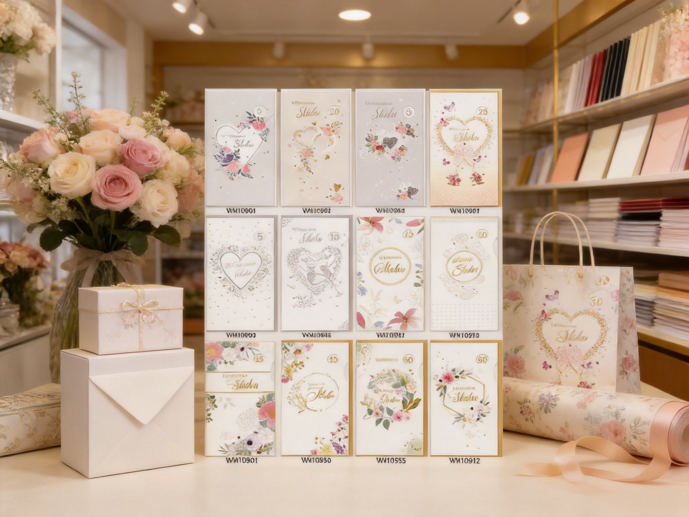
Valentine’s greeting cards are small products, but they carry an important emotional responsibility. They help people express affection, appreciation, friendship, gratitude, and seasonal warmth in a form that can be held, opened, displayed, and remembered. For that reason, a successful Valentine’s card must offer more than a printed message. It should create an appealing first impression, feel pleasant in the hand, coordinate naturally with gifts and flowers, and provide enough visual detail to make the recipient feel that the card was selected with care.
The Valentine’s Light Style Floral Paper Greeting Card is designed around these qualities. Its floral theme combines a calm appearance with a light, playful character, making it suitable for a broad range of Valentine’s occasions. The tall, slim card format gives the product a distinctive presence, while the matching envelope creates a complete presentation. More importantly, the card uses layered paper details and foil treatment to introduce texture and movement without allowing the decoration to become overly heavy.
This balance is the central strength of the product. Many seasonal cards compete through large illustrations, intense colors, glitter-heavy surfaces, or highly complex structures. The light floral card takes a more restrained approach. Its design is intended to look elegant at first glance and reveal additional details when examined more closely. Small raised paper elements, dimensional floral tips, and reflective foil accents give the surface a tactile quality that ordinary flat printing cannot provide.
For retailers, flower shops, gift stores, stationery buyers, event organizers, and brands creating seasonal gift collections, this makes the card a flexible packaging and communication accessory. It can be sold individually, included in a floral arrangement, added to a gift box, or coordinated with other paper products such as gift bags and patterned wrapping paper. Its design is festive enough for Valentine’s Day while remaining gentle enough for everyday romantic and friendship-focused exchanges.
Product Overview
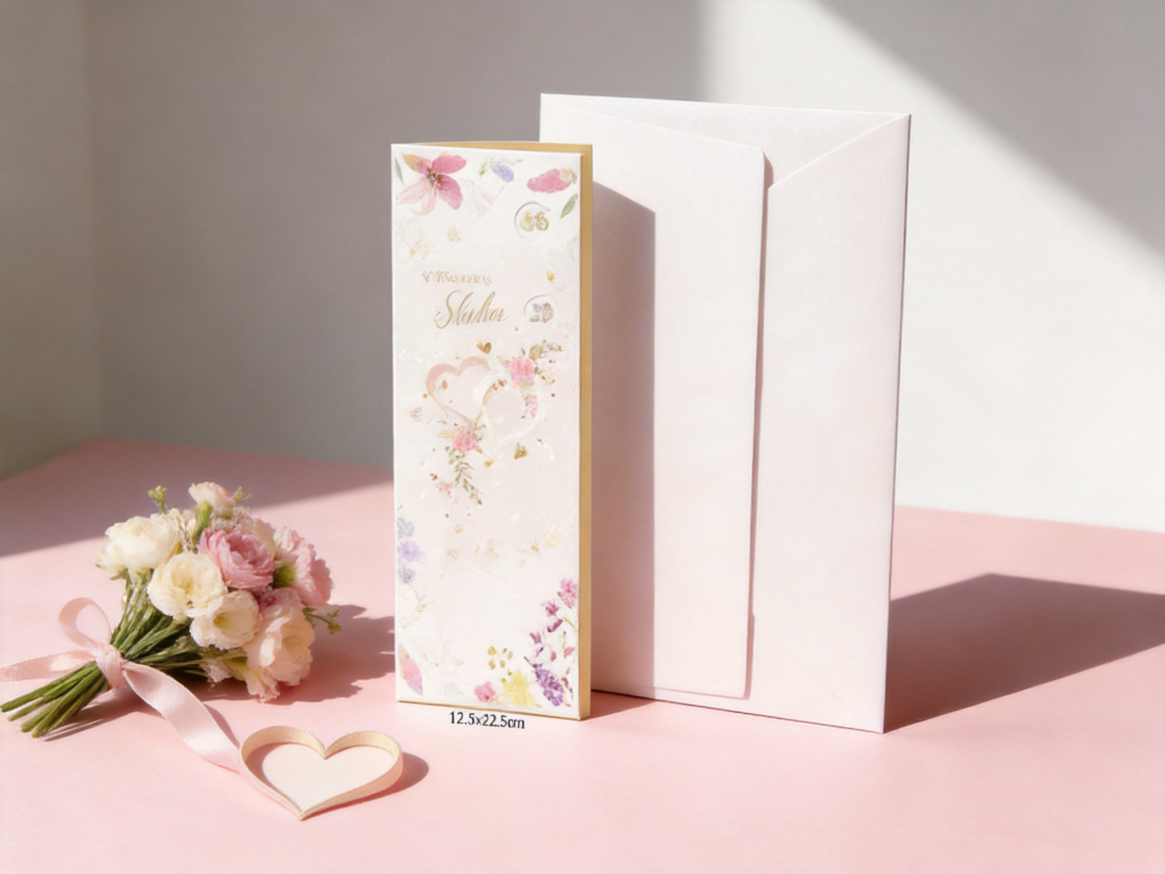
The Valentine’s Light Style Floral Paper Greeting Card is a paper greeting card developed for Valentine’s gifting and flower-inspired seasonal collections. The card measures 11.5 by 22 centimeters, while the envelope measures 12 by 22.5 centimeters. Together, they create a vertically oriented presentation that differs from many conventional square or horizontal greeting cards.
| Product Feature | Specification or Description | Practical Benefit |
|---|---|---|
| Product type | Valentine’s floral paper greeting card | Suitable for seasonal retail, floral bundles, and personal exchanges |
| Card size | 11.5 x 22 cm | Creates a tall, slim profile with a distinctive shelf and gift presentation |
| Envelope size | 12 x 22.5 cm | Provides a coordinated enclosure with a close-fitting appearance |
| Surface treatment | 3D Paper Tips | Adds raised texture and tactile depth to selected floral areas |
| Foil treatment | Spinning Numbers Bead Emboss foil | Introduces reflective detail and changing visual effects |
| Primary design direction | Light floral style | Offers a calm, playful, and approachable Valentine’s aesthetic |
| Suggested uses | Flower shop bundles, gift boxes, stationery sets, and personal gifting | Supports multiple sales channels and product combinations |
The measurements are carefully coordinated rather than selected independently. The envelope is slightly larger than the card, allowing the card to be enclosed while maintaining a neat and balanced appearance. This relationship is particularly useful for gift presentation, because the card and envelope can be placed together without looking mismatched or excessively loose.
The product’s tall proportions also create useful space for a floral composition. Flowers, stems, leaves, and vertical decorative elements can be arranged in a way that follows the shape of the card. This creates a more intentional visual rhythm than simply placing a small illustration in the center of a standard rectangle. The format may also work well beside a flower bouquet, where vertical lines and slender forms are already part of the overall presentation.
A Floral Design with a Light Emotional Character
The visual tone of a Valentine’s card affects how widely it can be used. A design that is too formal may feel distant, while one that is too ornate may not suit customers who prefer understated stationery. The light floral style occupies a useful middle ground. It communicates affection and seasonal relevance, but it does not rely exclusively on dramatic hearts, strong red tones, or exaggerated romantic symbols.
This broader emotional range gives the product flexibility. It may be used by partners, family members, friends, colleagues, and customers purchasing a card to accompany a flower order. The recipient does not need to interpret the card as an intensely romantic statement. The flowers provide warmth and sentiment, while the lighter treatment allows the sender to write a personal message that defines the exact relationship.
The design also fits current preferences for paper products that feel visually considered without appearing excessive. In many retail environments, customers compare cards quickly. They may respond first to color and overall composition, then examine the surface for details that justify the purchase. The light floral card is structured for this two-stage experience: it has a recognizable seasonal theme from a distance, followed by dimensional and reflective details at closer range.
Another advantage is its ability to coordinate with natural products. Flower shops often need cards that complement bouquets without competing with them. A card covered in very bright colors or large metallic areas can overpower delicate flowers. The softer floral treatment of this product can sit beside fresh or dried arrangements while preserving the bouquet as the visual focus.
For gift-box designers, the card can serve as a gentle decorative accent. It can be inserted into a box containing confectionery, fragrance, jewelry, cosmetics, candles, or other Valentine’s products. The card’s slim shape makes it easier to place along the side of a box, under a lid, or beside the main item. Its texture also helps the card remain visually noticeable even when surrounded by other packaging elements.
Dimensional Paper Details and Tactile Appeal
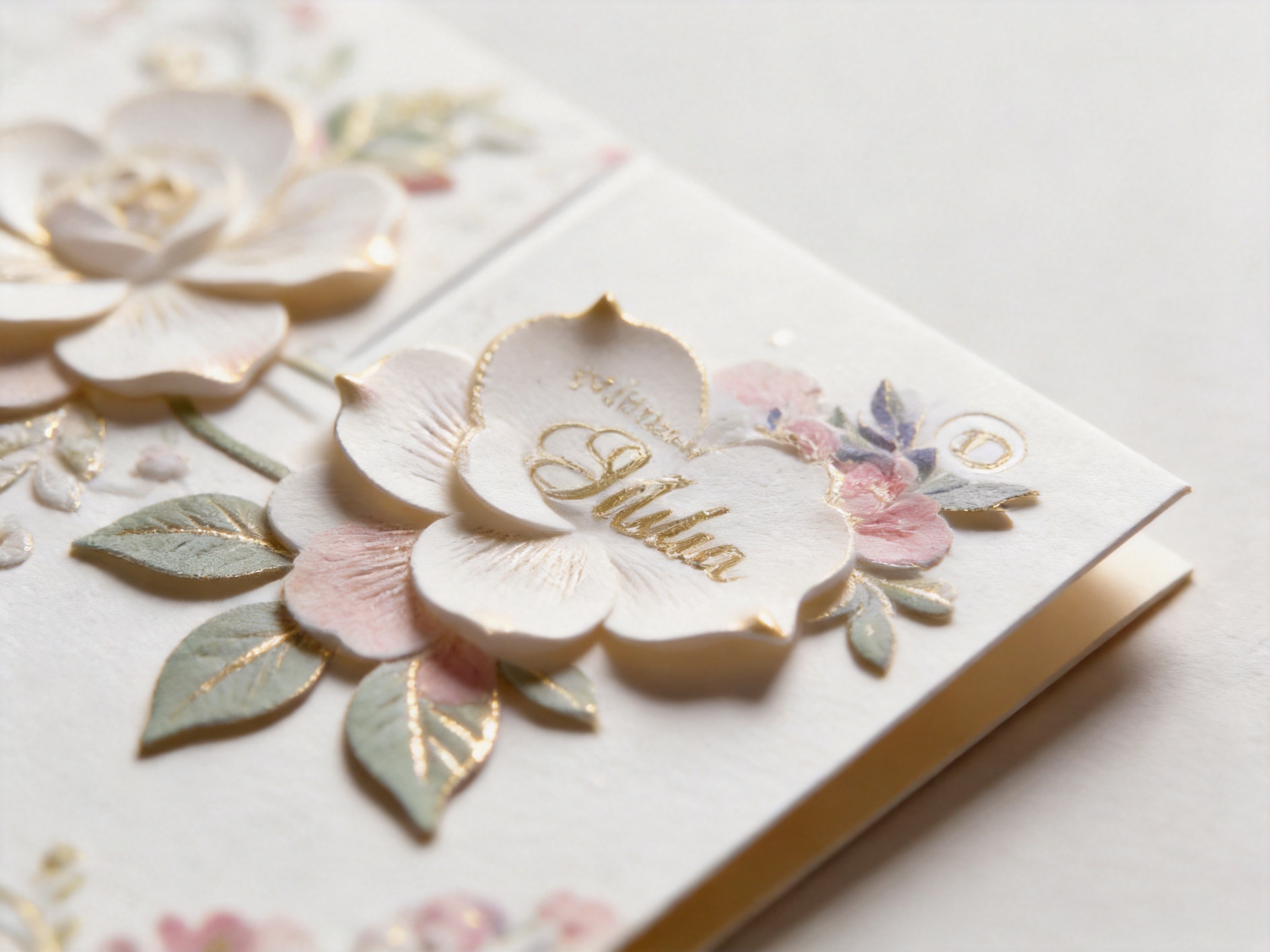
A key distinction between this product and a basic printed greeting card is the use of 3D Paper Tips. These small raised paper elements are applied to selected parts of the floral design. They do not necessarily cover the entire front surface. Instead, they can emphasize particular petals, leaves, decorative points, or other elements that benefit from additional depth.
This selective approach is important. If every part of a card is raised, the surface can become crowded, difficult to handle, and visually noisy. By concentrating the dimensional work in specific areas, the design retains a clean overall appearance while still offering a tactile discovery. When the recipient runs a finger across the card, the raised areas create a noticeable contrast with the smoother printed portions.
Texture can influence a customer’s perception of quality before the card is even opened. A flat printed card depends almost entirely on color and image quality. A card with carefully placed paper relief introduces another sensory layer. The recipient can see the floral composition, feel the raised details, and observe how the embellishments interact with light. This can make the product seem more carefully finished and more suitable for a meaningful occasion.
The 3D treatment also supports visual hierarchy. Raised paper tips can guide attention toward the central flower, a particular blossom, or a curved decorative feature. This helps the design appear more organized. Rather than presenting all details at the same visual level, the card creates foreground and background relationships through a combination of print, paper placement, and surface height.
From a merchandising perspective, tactile features may encourage customers to pick up the product. In a display rack or gift shop, many cards are first viewed edge-on or from a short distance. Once a shopper notices the floral image, the dimensional treatment gives them a reason to inspect the item more closely. This additional interaction can be valuable in retail settings where competing products are displayed together.
The dimensional elements are also compatible with a refined style because they are used as accents rather than as a complete structural transformation. The result remains a paper greeting card that can be handled, packaged, and combined with other products. It does not require the recipient to assemble complicated components, and it does not shift the product into the category of a bulky paper sculpture.
Reflective Foil and Changing Surface Movement
The card also includes Spinning Numbers Bead Emboss foil treatment. The terminology describes a decorative combination involving foil, embossed detail, and a bead-like or raised visual effect. On the finished card, this type of treatment can create areas that reflect light differently as the viewing angle changes.
Foil is especially effective on seasonal paper products because it adds a sense of occasion without requiring a large amount of metallic coverage. Small foil accents may appear bright when the card is moved, then become quieter when the surface is viewed from another direction. This change prevents the decoration from looking completely static. It gives the card a subtle sense of movement even though the product itself remains still.
The foil detail is not intended to dominate the floral composition. That restraint is one of its advantages. When metallic treatment is used excessively, it can flatten the visual balance by making every decorative area compete for attention. Here, the foil functions more like a highlight. It supports selected details, complements the raised paper tips, and creates moments of shine that become visible during handling.
Embossing adds another layer to the foil effect. A smooth metallic print reflects light, but an embossed surface can create small changes in shadow and brightness. These changes help the decorative elements remain visible under different store lighting conditions. In practical terms, the card may appear slightly different under warm boutique lighting, bright retail lighting, or natural daylight.
This angle-dependent appearance gives the product a premium impression without relying only on expensive or excessive materials. Customers may notice that the surface has more complexity than a conventional printed card. For gift buyers, this complexity can support the idea that the card is an important part of the present rather than an incidental note.

Valentine's Light Style Floral Paper Greeting Card
Advantages Compared with Conventional Greeting Cards
The Valentine’s Light Style Floral Paper Greeting Card has several advantages over a basic flat-printed card. The first is sensory variety. A standard card may offer a printed image and written message area, but this product adds raised paper details and reflective foil. These treatments provide the recipient with more than one way to experience the card.
The second advantage is visual restraint. Some competing Valentine’s cards depend on familiar motifs presented in highly saturated colors or large decorative arrangements. Those products may work well for customers seeking a dramatic romantic statement, but they may be less suitable for people who prefer calm stationery. The light floral card can appeal to buyers looking for something affectionate, tasteful, and less visually intense.
The third advantage is versatility. Because the floral theme is not limited to a single relationship type, the card can be used across several purchase occasions. A flower shop may include it with a bouquet. A gift retailer may place it inside a Valentine’s gift set. A company may use it within a seasonal stationery collection. An individual may give it to a partner, friend, relative, or someone they appreciate.
The fourth advantage is format differentiation. The 11.5 by 22 centimeter card has a tall, slim appearance that can help it stand apart from common card shapes. Distinctive proportions are useful in displays because they give buyers another visual point of recognition. The envelope reinforces this difference by following the same vertical direction.
The fifth advantage is the combination of decoration and usability. The card is visually detailed, but its basic function remains clear. It is still a greeting card with an envelope, not an object that requires complex assembly or special presentation instructions. Customers can write a message, enclose the card, and add it to a gift with minimal effort.
Compared with cards that use only glitter, the foil and embossed treatment can offer a more controlled and polished surface effect. Glitter often produces strong sparkle and may shed during handling, depending on the construction method. Foil and embossing provide shine and texture through an integrated surface treatment. The exact performance depends on production specifications, but the design direction supports a cleaner and more refined appearance.
Compared with heavily layered pop-up cards, this product is easier to store and display. It maintains a relatively slim profile, which can be helpful for retailers managing racks, shelves, drawers, and shipping cartons. It also avoids the mechanical complexity associated with movable paper structures while still providing dimensional interest.
Compared with inexpensive mass-market cards, the product offers more opportunities for perceived value through finishing. Retail customers often evaluate not only the printed artwork but also the tactile quality, envelope coordination, surface depth, and overall presentation. These elements can support a stronger premium position when the card is merchandised appropriately.
Suitable Applications Across Gift and Retail Collections
Flower Shop Bundles
The natural connection between flowers and greeting cards makes this product especially suitable for florist applications. A card can be tied to a bouquet, placed inside a wrapping sleeve, or included in a delivery package. The floral theme reinforces the product category while the slim format avoids adding unnecessary bulk to the arrangement.
Florists may use the card for pre-designed Valentine’s packages or offer it as an optional add-on during checkout. Its calm visual style can complement roses, tulips, lilies, mixed seasonal flowers, dried arrangements, and pastel bouquets. Because it is not limited to one flower type, the card can be used across a variety of arrangements.
Gift Boxes and Seasonal Sets
Gift-box companies can include the card as a communication element within a larger Valentine’s package. The card may be positioned above the product, under the lid, or in a dedicated paper compartment. The dimensional details can help it remain noticeable when placed alongside tissue paper, ribbons, wrapping paper, and other accessories.
The product can also be paired with gift bags and patterned wrapping paper to form a coordinated paper collection. A retailer may build a complete seasonal display using a matching visual language across bags, boxes, cards, and wrapping materials. This approach can improve shelf cohesion and make it easier for customers to purchase several complementary items at once.
Event and Hospitality Stationery
Valentine’s events, restaurant promotions, hotel packages, and private celebrations may require small stationery pieces that convey warmth without looking overly formal. The floral card can be used as a table message, thank-you note, guest welcome card, or part of an event gift set. Its design can support romantic dinners, floral workshops, afternoon tea events, and seasonal retail promotions.
For larger orders, buyers may also explore customized printing or changes to the message area, provided that the required specifications are confirmed during the development process. Customization may allow the product to carry a retailer’s message, event wording, or coordinated seasonal identity while preserving the underlying floral direction.
Personal Exchanges
At the consumer level, the card works for many kinds of personal messages. A sender may write a romantic note, a short expression of appreciation, a friendship message, or a simple seasonal greeting. The front design establishes the occasion, while the inside provides room for the sender’s individual words.
This flexibility is commercially useful because Valentine’s Day purchasing is not limited to couples. Many customers buy cards for friends, family members, children, teachers, colleagues, and people who have offered support. A gentle floral design can serve these broader relationships more comfortably than a card built around an intensely romantic phrase.
Manufacturing Capabilities Supporting Product Quality
The product is manufactured by a paper packaging company with experience spanning nearly three decades. The business began in 1996 as Fushida Plastic Factory and was rebranded in 2019 as Magic Tree Paper Products Co., Ltd. Its product scope includes paper bags, gift bags, gift boxes, greeting cards, and patterned wrapping paper made from materials such as white cardboard, coated paper, and kraft paper.
This background is relevant to the greeting card because quality is influenced by more than the artwork alone. Paper selection, printing control, laminating, creasing, foil application, die work, manual finishing, inspection, and packing all affect the final result. A manufacturer that works across several paper packaging categories can apply related knowledge to the card’s structure, surface, and presentation.
The company maintains in-house capabilities covering professional design and prepress, laminating, hot stamping, creasing, printing, bag making, and manual finishing. Having these processes managed within the same production organization can improve communication between stages. Artwork files, material decisions, finishing requirements, and assembly instructions can be reviewed as part of one connected workflow rather than being separated among unrelated suppliers.
For a card with raised paper tips and foil detail, this coordination is especially important. Dimensional paper elements must be placed accurately in relation to the printed floral artwork. Foil and embossed features must also align with the intended design areas. If the print, embellishment, and finishing stages are not carefully coordinated, small shifts may reduce the visual quality of the product.
In-house prepress capabilities support the preparation of artwork for these requirements. Before production, the design can be examined for line thickness, registration, foil boundaries, paper layering, and finishing tolerances. Prepress review helps reduce avoidable problems such as fine details becoming unclear, decorative elements being positioned too close to a fold, or foil areas failing to match the visual composition.
Printing capability is equally important. Floral designs often contain delicate outlines, subtle color relationships, and small decorative components. Consistent printing helps preserve the intended contrast between the background, flowers, raised paper tips, and foil areas. A stable production process can also support repeat orders in which later batches need to remain visually close to earlier stock.
Laminating and surface finishing may be selected according to the desired appearance, durability, and material specification. The exact treatment should be confirmed for each order, but the company’s broader paper-product capabilities provide a foundation for discussing protective and decorative finishes. This is useful for buyers who want to coordinate greeting cards with gift bags, boxes, and wrapping paper produced through related processes.
Creasing is another important technical stage for paper products. Accurate creasing helps a card fold cleanly and reduces the risk of rough or uneven folding lines. Even when a design is visually attractive, poor folding can affect the recipient’s first impression. Controlled creasing supports a more professional appearance and makes the card easier to open and close.
Manual finishing contributes to the product’s dimensional character. Small 3D Paper Tips and other decorative details may require careful placement, inspection, or assembly. Manual work can be valuable when a design includes features that are difficult to manage through a fully automated process. It also creates an opportunity for workers to inspect individual pieces during finishing.
The company operates its own factory and manages production from raw materials to finished products. This integrated approach can support quality consistency, production scheduling, and communication. For wholesale buyers, direct factory coordination may also make it easier to discuss quantities, packaging, finishing options, sampling, and repeat production requirements.
With annual output value exceeding 50 million yuan, the manufacturer has the operational scale to support a range of paper packaging orders. Scale does not replace quality control, but it can provide useful production infrastructure. Buyers may benefit from established equipment, experienced production staff, organized workflows, and the ability to coordinate several related paper products for a seasonal campaign.
Material Options and Responsible Paper Packaging Considerations
The company specializes in white cardboard, coated paper, and kraft paper products. Each material family can support a different visual and functional direction. White cardboard may provide a clean base for colorful or delicate artwork. Coated paper can support smooth print reproduction and a polished appearance. Kraft paper may be suitable for collections that emphasize a more natural or rustic presentation.
The specific material used for this greeting card should be confirmed according to the final product specification. Buyers may need to consider stiffness, folding performance, color reproduction, surface finish, compatibility with foil, and the intended retail position. These decisions are best made during sampling, when the physical interaction between paper, printing, embossing, and dimensional elements can be assessed.
The company also offers eco-friendly paper packaging grades. This creates an opportunity for buyers who want their seasonal collections to align with paper-based packaging preferences. However, environmental claims should always be tied to the actual material, coatings, inks, finishing methods, packaging configuration, and relevant documentation selected for a particular order.
For responsible procurement, buyers should request clear information about the proposed paper grade and finishing system. They may also evaluate whether the envelope and card use compatible materials, whether unnecessary plastic packaging can be reduced, and how the finished items will be packed for shipment. A paper product can support a more responsible packaging strategy, but the complete supply chain should be considered rather than judging the card by appearance alone.
The product’s slim construction may also help with efficient storage and packing compared with bulkier paper gift accessories. The card and envelope can be stacked in organized quantities, stored in cartons, and distributed through retail channels without requiring large display fixtures. Transport efficiency depends on the final packing method and order volume, but the format is naturally suited to compact handling.
Quality Control from Artwork to Finished Card
A greeting card with multiple finishing treatments benefits from quality control at several stages. The first stage is artwork review. At this point, the manufacturer and buyer can confirm the floral composition, color references, message area, envelope relationship, and locations of raised or foil elements.
The second stage is material preparation. Paper must be checked for the required weight, surface, color, and folding behavior. If the paper is too soft, the raised details may not appear sufficiently defined. If it is too rigid, folding and envelope insertion may become less convenient. The material must therefore be selected in relation to the complete product construction.
The third stage is print control. Important checks may include color consistency, image sharpness, registration, text clarity, and the relationship between printed artwork and finishing areas. Floral designs often contain fine details, so accurate reproduction is important to the product’s overall character.
The fourth stage is embellishment control. The 3D Paper Tips should be positioned consistently, and the foil or embossed treatment should correspond to the approved artwork. Inconsistent placement can make a collection look uneven, particularly when multiple cards are displayed together.
The fifth stage is folding and assembly. The card should fold along the intended crease, fit properly with the envelope, and maintain a clean edge. The envelope should be checked for size compatibility and general presentation. These practical details influence customer satisfaction even though they may not be visible in a product photograph.
The final stage is packing inspection. Finished cards should be protected from bending, scuffing, moisture, and pressure that might affect raised details. Appropriate packing also helps maintain organized quantities for wholesale buyers and reduces unnecessary handling before the products reach a store or fulfillment center.
Factory control across these stages can reduce communication gaps. Instead of sending artwork to one supplier, printing to another, and manual finishing to a third party, a buyer can coordinate through a manufacturer with broader internal capabilities. This does not eliminate the need for approval samples and production checks, but it can make the process more direct and manageable.
How Buyers Can Build a Strong Seasonal Collection
The greeting card can be used as the starting point for a broader Valentine’s paper collection. A retailer might combine the card with a gift bag in a related floral color palette, a gift box with coordinated accents, and patterned wrapping paper that repeats selected botanical elements. This creates a consistent customer experience across several purchase points.
Product grouping can also improve merchandising. Cards may be displayed next to bouquets, ribbons, candles, chocolates, or small personal gifts. A tall, slim card can be placed upright in a holder, attached to a gift display, or arranged beside other vertical packaging pieces. The dimensional surface may be especially effective when the display allows customers to view the card from the front and handle it safely.
For wholesale buyers, it is useful to define the intended sales channel before finalizing specifications. A card sold through a flower shop may need a different packing quantity and display approach from one sold through an online gift store. A card included in a subscription box may require different protection from one sold individually in a stationery shop.
Buyers should also decide whether the product will remain as shown or be customized. Possible discussion points may include paper type, color adjustments, interior wording, envelope changes, logo placement, finishing combinations, packaging quantities, and carton markings. Customization should be evaluated carefully so that additional elements do not weaken the light and uncluttered quality of the floral design.
Sampling is particularly valuable for this product. A physical sample allows buyers to examine the raised paper tips, move the card under different lighting, test the envelope fit, inspect the fold, and compare the card with proposed gift bags or boxes. These practical observations are difficult to make from digital artwork alone.
Why the Product Works for Modern Gifting
Modern gifting often combines convenience with a desire for personal meaning. Customers may purchase a gift online or select a pre-arranged package in a store, but they still want the final presentation to feel personal. A greeting card provides the space for that personal element. The light floral card supports this role by adding visual and tactile quality without requiring a complicated gifting process.
Its design also reflects the growing importance of details. A customer may choose a card because of its overall appearance, but the raised tips and foil treatment can make the item feel more special after purchase. The recipient can keep it, display it, or place it with other meaningful paper memories. In this way, the card becomes more than disposable communication; it can become part of the emotional record of an occasion.
The product’s restrained floral style is also adaptable to different cultural and commercial settings. Flowers are widely associated with affection, celebration, and goodwill, while the absence of an overly specific message leaves room for local retail positioning. Buyers can present the card as romantic, friendly, appreciative, or seasonal depending on the accompanying products and sales copy.
For brands, this adaptability can support a coherent seasonal campaign. The card can carry a gentle visual mood that appears in packaging, point-of-sale materials, social media photography, and gift-set presentation. Its foil details may also photograph attractively when light catches the surface, although product photography should be tested to ensure that the dimensional features are clearly visible.
Ordering and Customization Discussion Points
When evaluating the product for wholesale purchase, buyers should begin by confirming the intended quantity, delivery schedule, target market, and sales channel. These factors influence material selection, production planning, packing requirements, and the level of customization that is practical for the order.
The next step is to confirm the technical specification. Buyers should review the 11.5 by 22 centimeter card size, 12 by 22.5 centimeter envelope size, paper options, folding direction, interior printing, surface treatment, and the exact interpretation of the Spinning Numbers Bead Emboss foil treatment. A clear specification reduces the risk of misunderstandings during quotation and sampling.
Artwork should be supplied in an appropriate production format and reviewed by the manufacturer’s prepress team. The design file should identify printed areas, raised paper elements, foil areas, folds, cutting lines, and any variable text. If a buyer wants to alter colors or add branding, those changes should be reviewed for compatibility with the light floral design.
Buyers should request a sample or proof before approving mass production. The sample can be used to assess the tactile contrast of the 3D Paper Tips, the clarity of the foil, the envelope fit, the writing area, and the overall balance of the card. It is also an opportunity to compare the product with the intended gift bag, box, wrapping paper, or flower arrangement.
Packaging should be discussed early rather than after production. The buyer may need individual sleeves, bundled quantities, protective cartons, barcode labels, or retail-ready packing. The selected method should protect the raised and foil details while remaining efficient for storage and distribution.
Frequently Asked Questions
What is the main design style of the greeting card?
The card uses a light floral style with a calm and slightly playful character. It is designed for Valentine’s gifting and seasonal flower-inspired collections without relying on overly heavy decoration.
What are the card and envelope dimensions?
The card measures 11.5 by 22 centimeters. The envelope measures 12 by 22.5 centimeters, creating a coordinated tall and slim presentation.
What makes the surface different from a standard printed card?
The product includes 3D Paper Tips applied to selected parts of the floral design. These details sit slightly above the surface and create a tactile effect when the card is handled.
What does the foil treatment add?
The Spinning Numbers Bead Emboss foil treatment adds reflective and embossed detail. Its appearance can change as the card is viewed from different angles, creating subtle surface movement and depth.
Can the card be used for messages other than romantic greetings?
Yes. The floral design is suitable for romantic messages, friendship notes, family greetings, appreciation messages, flower deliveries, and other seasonal exchanges. The interior wording and accompanying gift can define the exact occasion.
Is the product suitable for flower shops?
Yes. The floral theme, slim format, and matching envelope make it suitable for bouquet bundles, flower deliveries, seasonal displays, and optional card add-ons.
Can the card be included in a gift box?
Yes. Its relatively slim profile allows it to be placed inside many gift boxes or positioned beside the main product. The dimensional surface can provide a visible decorative accent within the package.
What paper materials are available?
The manufacturer works with white cardboard, coated paper, and kraft paper products. The appropriate material for this card should be confirmed according to the required stiffness, appearance, printing, folding, and finishing specifications.
Are eco-friendly material options available?
The company offers eco-friendly paper packaging grades. Buyers should confirm the exact paper, coatings, inks, finishing treatments, and documentation for the specific greeting card order before making environmental claims.
Can the card be customized?
Customization can be discussed with the manufacturer. Potential areas may include artwork, colors, interior wording, paper selection, finishing, packaging, and coordinated products. Final options depend on the order requirements and approved production specification.
Why is factory integration useful for this product?
The company manages design and prepress, printing, laminating, hot stamping, creasing, bag making, and manual finishing. Coordinating these capabilities through one manufacturing organization can support communication between artwork, printing, dimensional paper details, foil treatment, and final assembly.
What should buyers check before mass production?
Buyers should review a physical sample, confirm card and envelope dimensions, inspect the paper and fold, evaluate the raised tips and foil, approve artwork, confirm packing, and verify the production schedule. These checks help ensure that the finished product matches the intended retail position.
Conclusion
The Valentine’s Light Style Floral Paper Greeting Card offers a carefully balanced alternative to ordinary seasonal stationery. Its tall, slim proportions create a recognizable presentation, while the coordinated envelope completes the product. The light floral theme makes the card suitable for romantic gifting, friendship messages, flower shop bundles, gift boxes, event stationery, and broader seasonal collections.
Its strongest product advantages come from the combination of understated design and tangible finishing. The 3D Paper Tips give selected floral areas a raised feel, while the Spinning Numbers Bead Emboss foil treatment introduces reflective detail that changes subtly with viewing angle. Together, these features provide more visual and tactile interest than a flat-printed card while avoiding the excessive decoration associated with some competing products.
For wholesale buyers, the manufacturer’s long experience in paper packaging adds value to the product discussion. In-house design and prepress, printing, laminating, hot stamping, creasing, and manual finishing capabilities support an integrated manufacturing process. The company’s experience with white cardboard, coated paper, kraft paper, gift bags, gift boxes, greeting cards, and patterned wrapping paper also makes it possible to develop coordinated seasonal packaging collections.
When the card is supported by careful material selection, accurate prepress, controlled printing, precise finishing, and suitable packing, it can function as more than a simple enclosure for a message. It becomes a refined part of the gift experience: light in mood, distinctive in format, tactile in construction, and adaptable to many forms of Valentine’s communication.
References
1. Product specification supplied for the Valentine’s Light Style Floral Paper Greeting Card, including card size, envelope size, and surface treatments.
2. Company information supplied for the paper packaging manufacturer, including manufacturing history, product categories, factory capabilities, and international market coverage.
3. General principles of paper product design, including visual hierarchy, tactile finishing, dimensional embellishment, folding, and packaging presentation.
4. General considerations for responsible paper packaging procurement, including material selection, finishing review, supply-chain documentation, and packaging efficiency.
5. General retail merchandising practices for greeting cards, flower shop accessories, seasonal gift sets, and coordinated paper packaging collections.